siren
A wellness space built to keep people, not process them.
- Disciplines
- Brand Identity, Art Direction, Visual System, Experiential
- Category
- Identity, Art Direction, Experiential
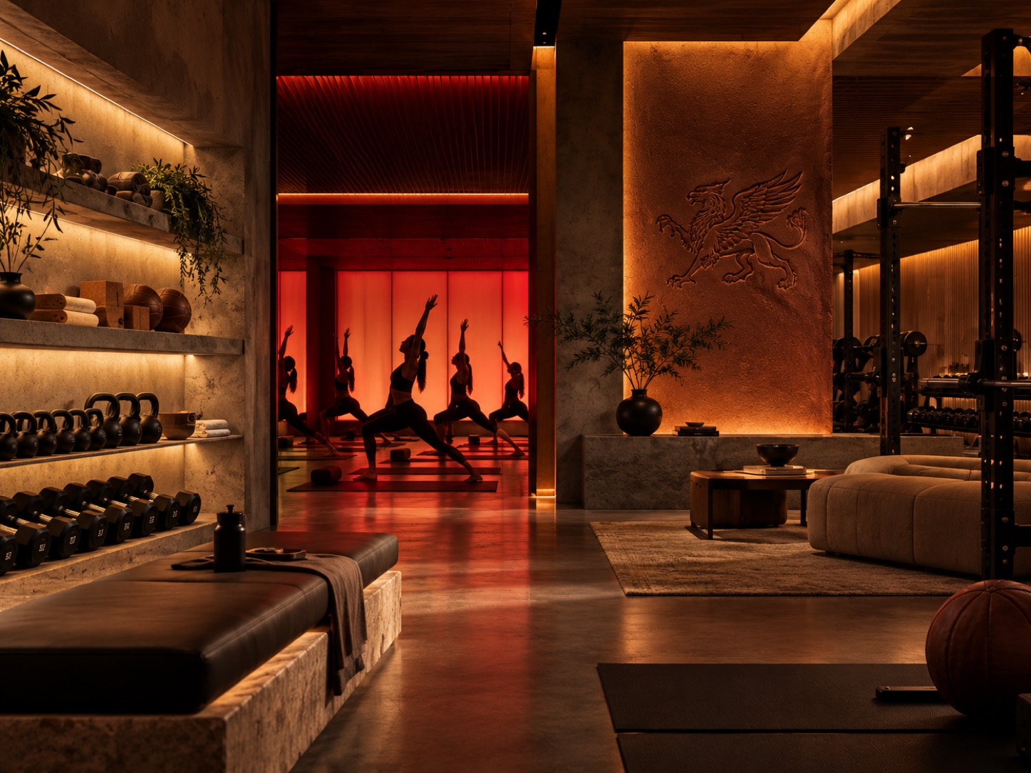
Siren is a movement and wellness space that behaves less like a gym and more like somewhere you arrive and then stay. The brief was a third place rather than a room people enter, exercise in, and leave, so the identity had to carry ritual and escape as much as it carried a timetable.
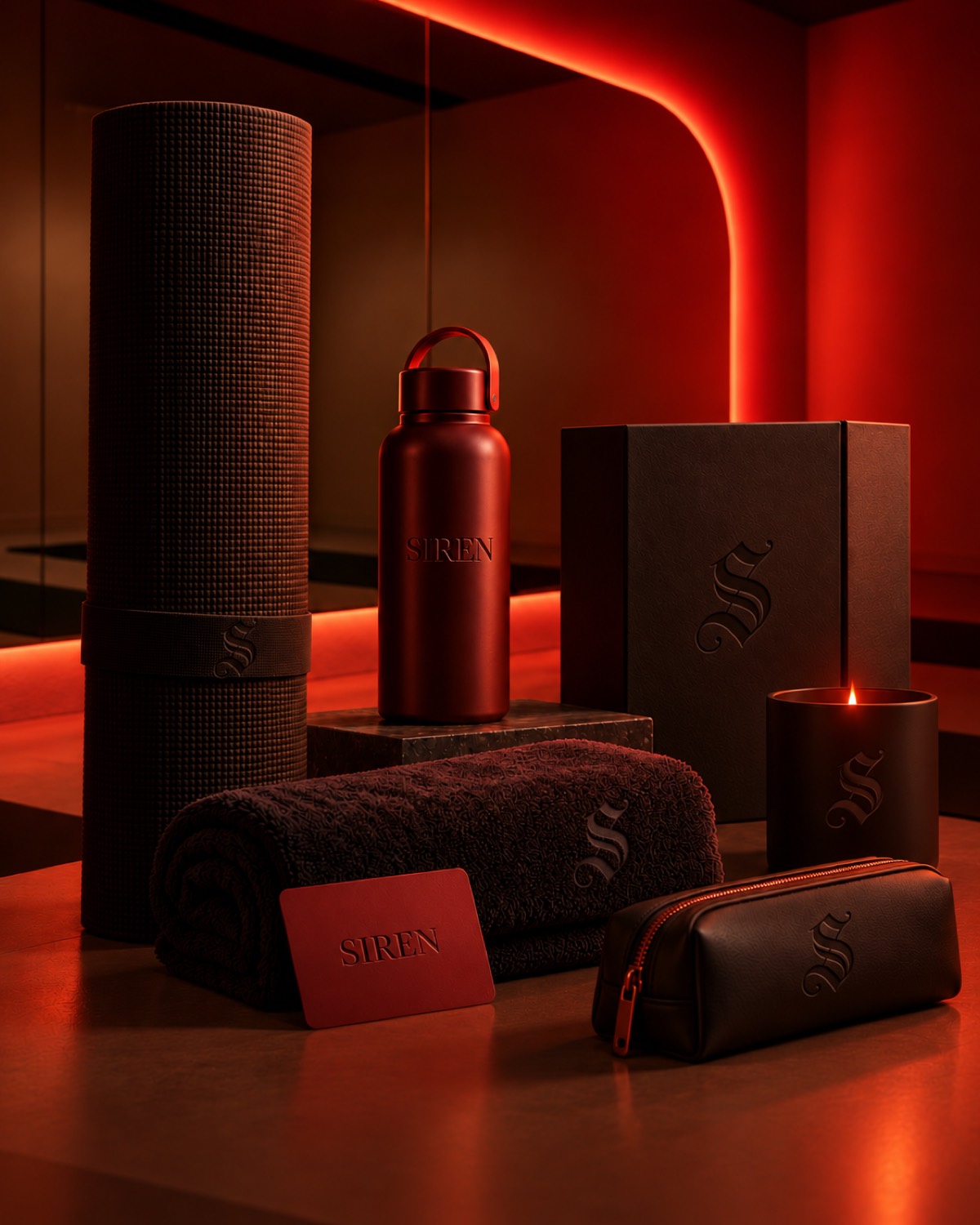
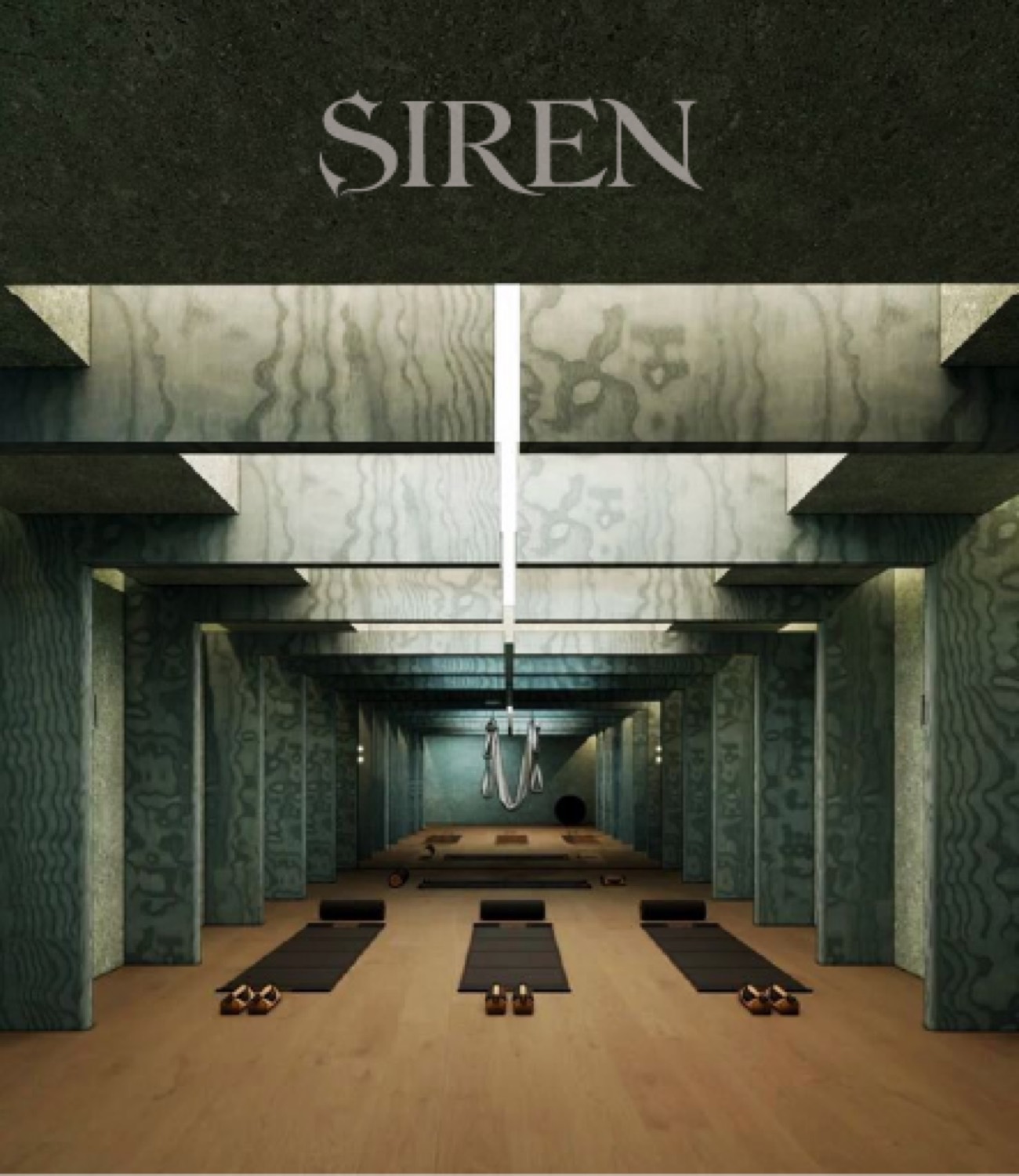
The identity sits low and still, built on a high contrast serif that holds its nerve at small sizes and reads as architecture at large ones. Deep green and a saturated red do the rest. The red is the unexpected part for this category, and it is what stops the whole thing drifting toward the sterile calm every wellness brand defaults to.
The world is meant to feel immersive and a little sensual. Premium without being clinical, luxurious without becoming a traditional spa, with light doing most of the decorating so the graphic layer can stay out of the way.
The system was drawn to work on a wall before it works on a screen, which is usually the right order for a space people walk into. Our work ran across identity, art direction, the visual system, and the wider experiential world of the place.

Nextalt five