alt five
Electrolytes for people who actually train, designed to be seen.
- Disciplines
- Brand Identity, Packaging Direction, Visual System, Art Direction
- Category
- Identity, Packaging, Art Direction
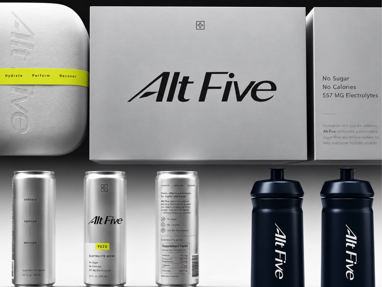
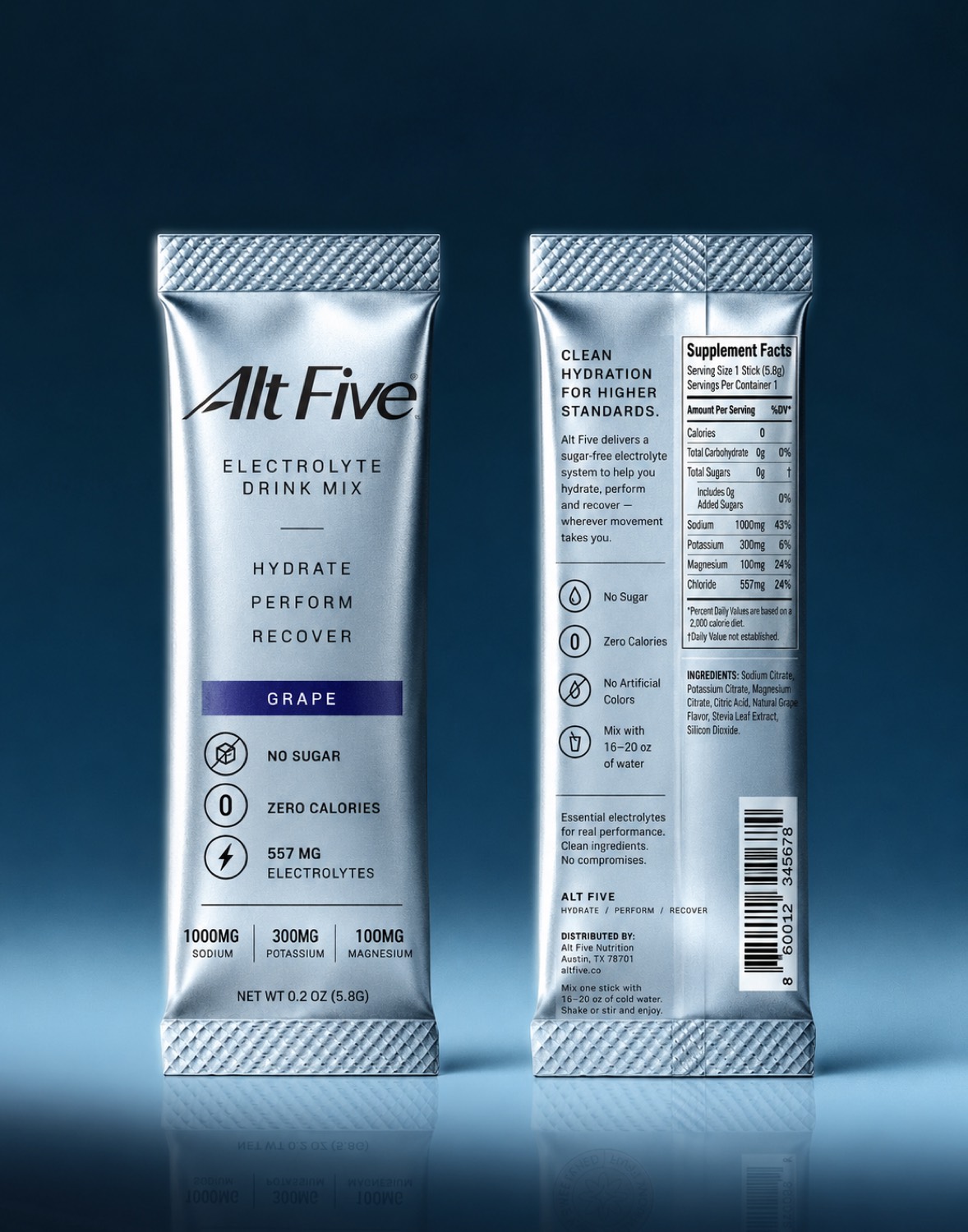
Alt Five is an electrolyte brand for runners and people with properly active lives, sold both as cans and as pouches. The identity had to work on a sachet held at arm's length and on a road at speed, which are very different distances.
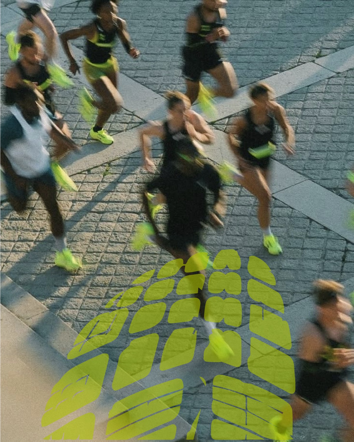
It sits deliberately between performance, fashion, and contemporary wellness. Metallic surfaces carry the technical, high performance half of that, while a single acid green gives the system its energy and makes it recognisable from across a room. The green runs through everything and acts as a marker: on the road, on the can, on the type.
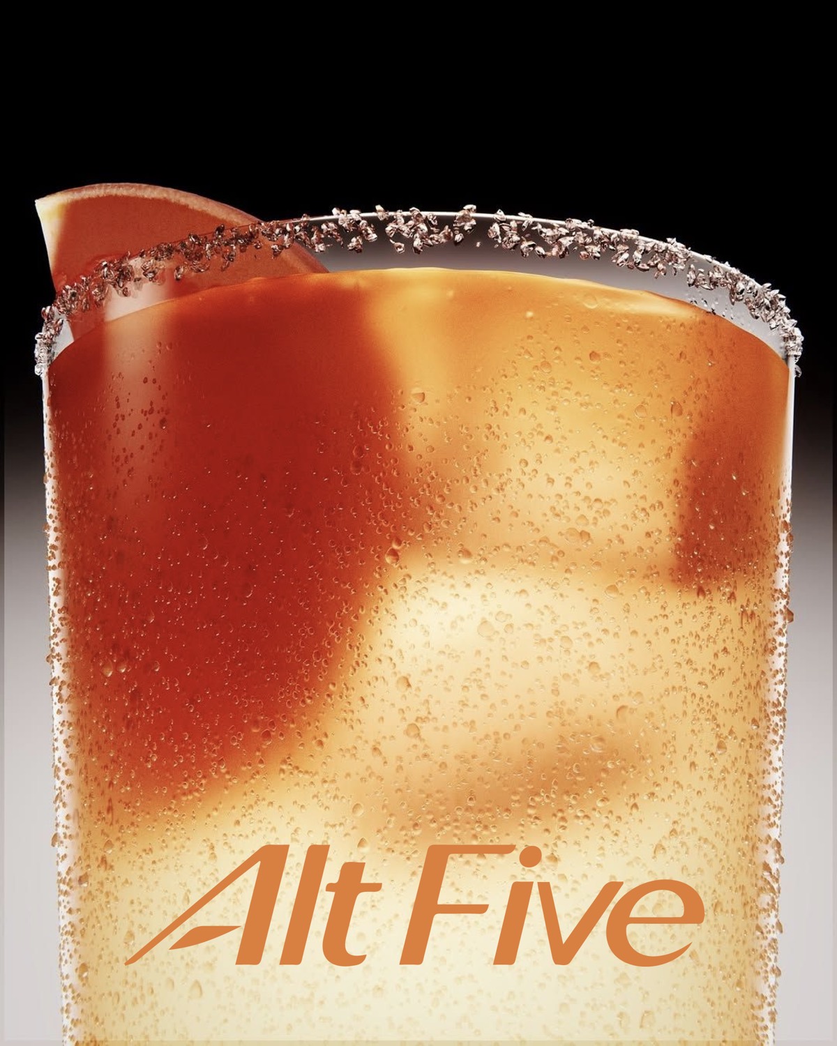
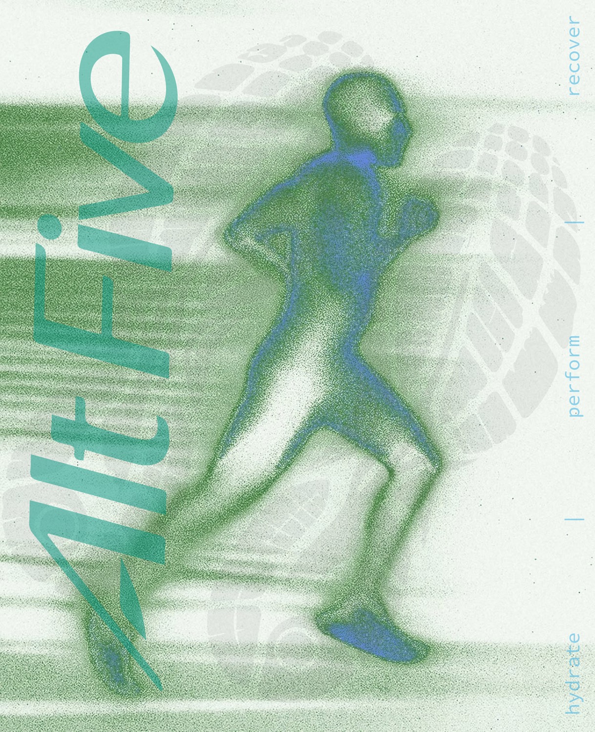
The photography leans into motion rather than trying to freeze it, so it stays blurred and the graphic layer does the holding. The packaging keeps its information tight and legible while the campaign stays loud, because one is read in a hand and the other is read in public.
The test was whether it could sit in a gym bag, a running kit, a fridge, and a feed without turning into another shouting sports nutrition brand. Our work covered the identity, branding, packaging direction, and the visual system.
Nextbar 57