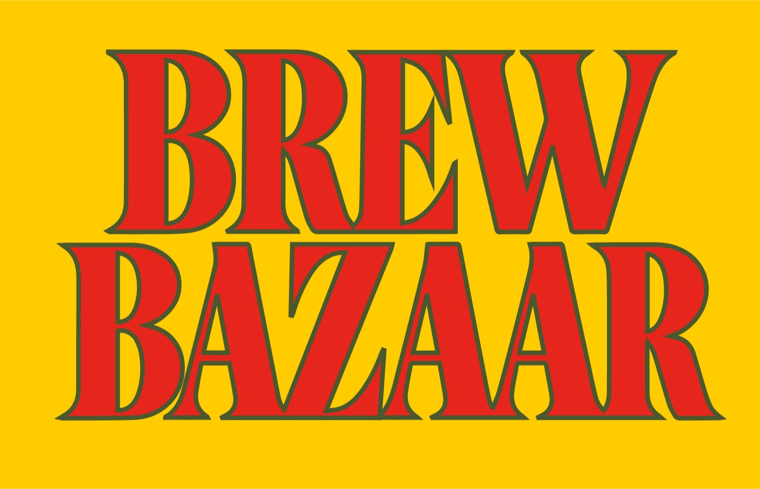
brew bazaar
Indian coffee, packed like something you keep the box of.
- Disciplines
- Brand Strategy, Brand Identity, Visual Systems, Packaging Direction, Typography, Illustration
- Category
- Identity, Packaging, Illustration
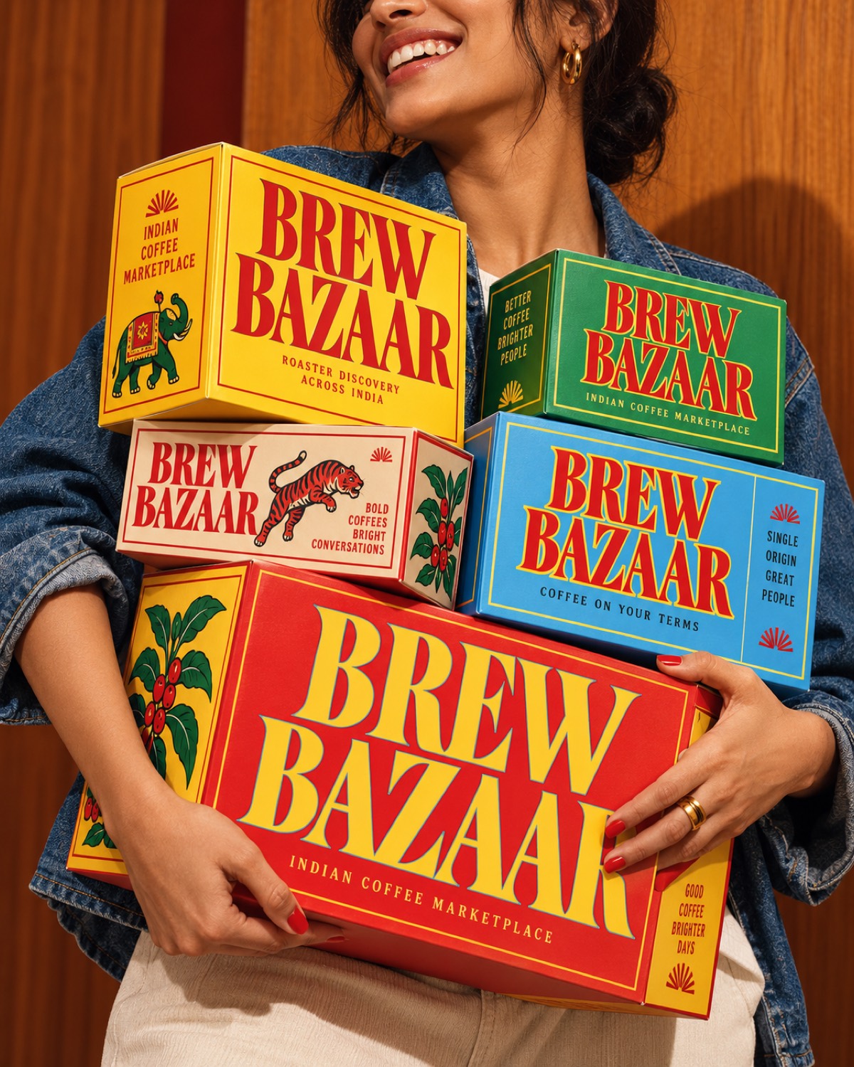
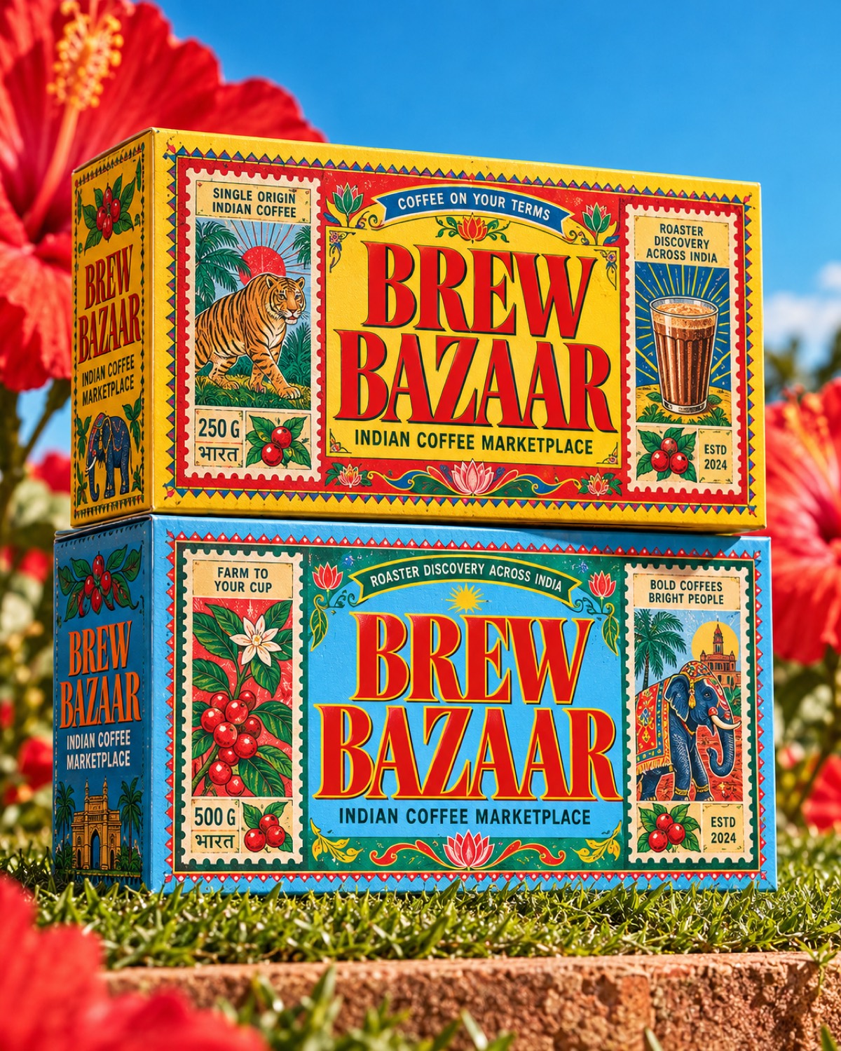
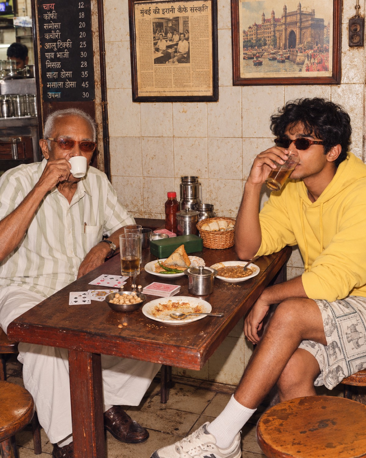
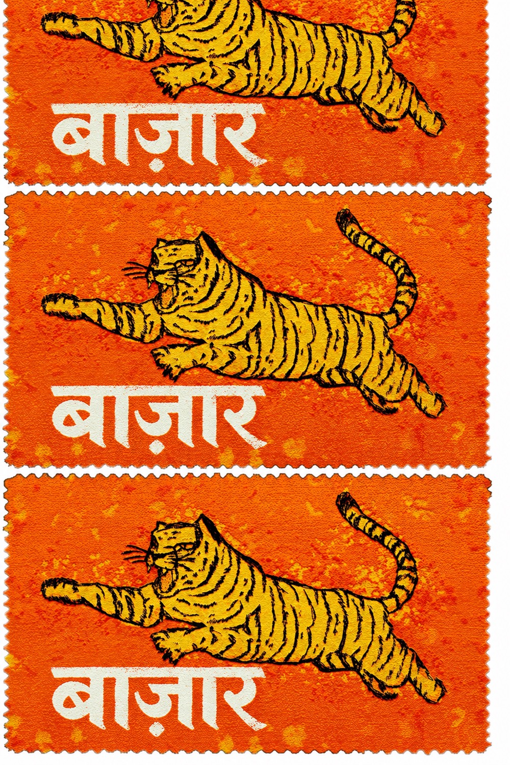
Brew Bazaar is an Indian coffee marketplace built around discovery and the independent coffee culture growing around it. The packaging borrows from the visual culture it comes out of: matchbox labels, tea chest stencils, stamp lithography, printed ephemera, and the tiger and the elephant doing what they have always done on Indian packaging.
India is visually dense. Layered, expressive, full of competing type, colour, symbols, signage and print, and the system was built to take that energy rather than sanitise it into another minimal specialty coffee brand. Every box is a full illustration rather than a logo on a colour.
What holds it together is structure. The typography is disciplined and repeats exactly, which is what lets the palette change completely from one product to the next without the range falling apart.
The harder part was making the references read as current rather than as costume. The drawing is new rather than reproduced, the colour is pushed past its sources, and the layouts are built to modern packaging standards, so it reads as a contemporary Indian brand rather than a reproduction of an older one. Our work covered brand strategy, identity, visual systems, packaging direction, typography, the illustration language, and the wider marketplace world.
Nextakhai