akhai
A Pakistani beauty house, built for a global shelf.
- Disciplines
- Brand Identity, Packaging, Visual Direction, Brand World
- Category
- Identity, Packaging, Art Direction
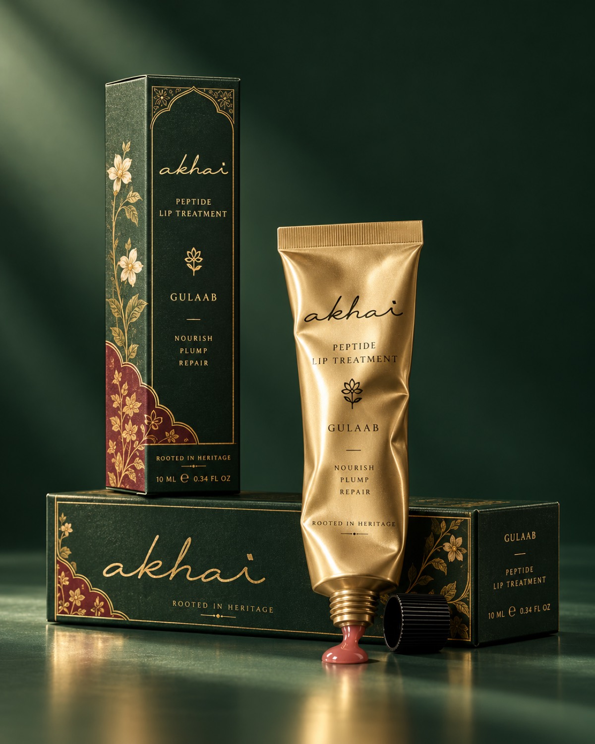
Akhai is a contemporary Pakistani beauty house, bringing Pakistani beauty traditions and ingredients into a global context. The range runs across several treatments, with Gulaab, the rose, carrying the first of them, and the naming stays in its own language rather than translating itself for export.
The formulations lean on ingredients that are familiar at home and largely unfamiliar abroad, ghee among them. The job of the identity was to present those honestly while speaking the language of contemporary beauty fluently enough that the brand reads as current anywhere it lands, rather than as heritage on display.
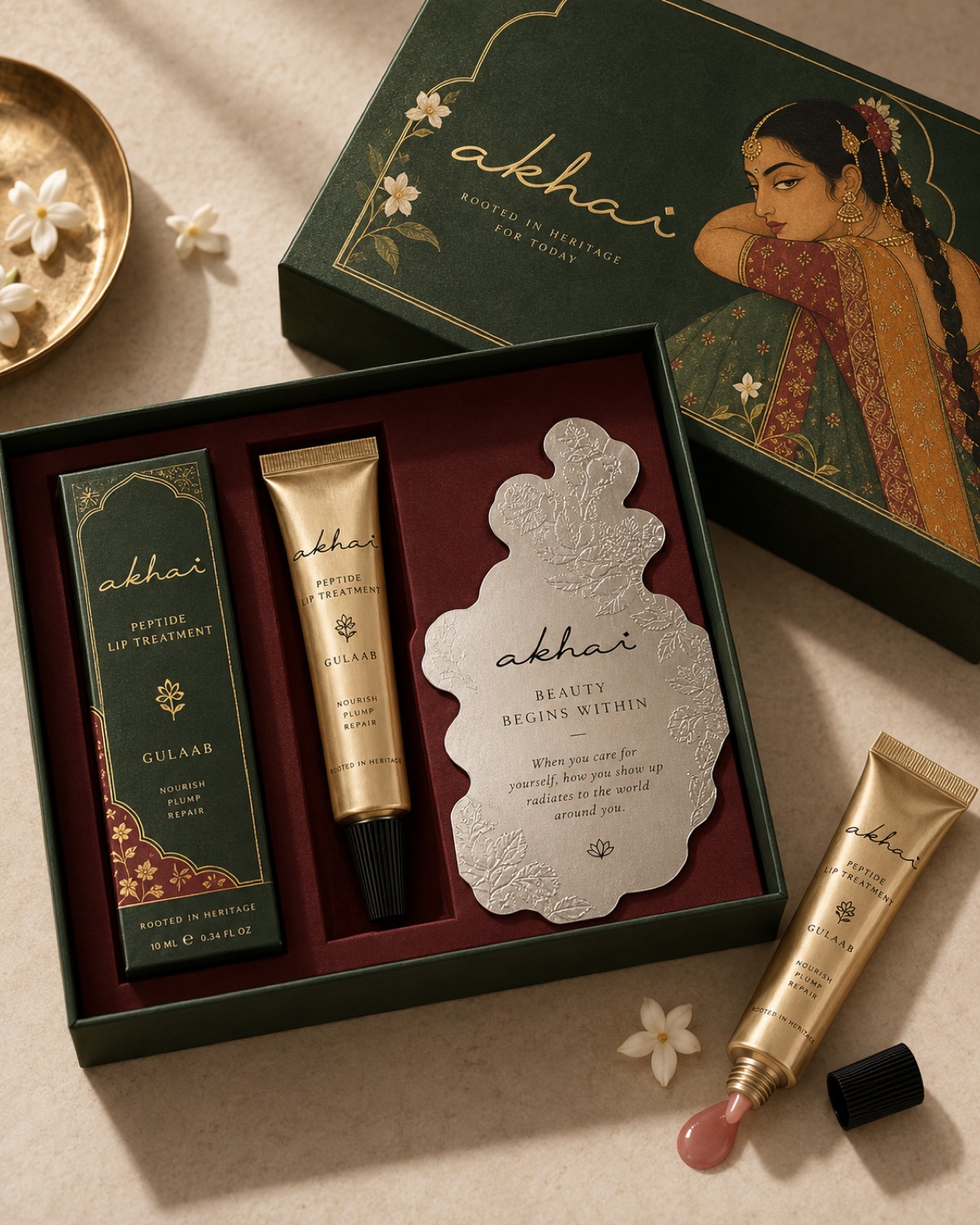
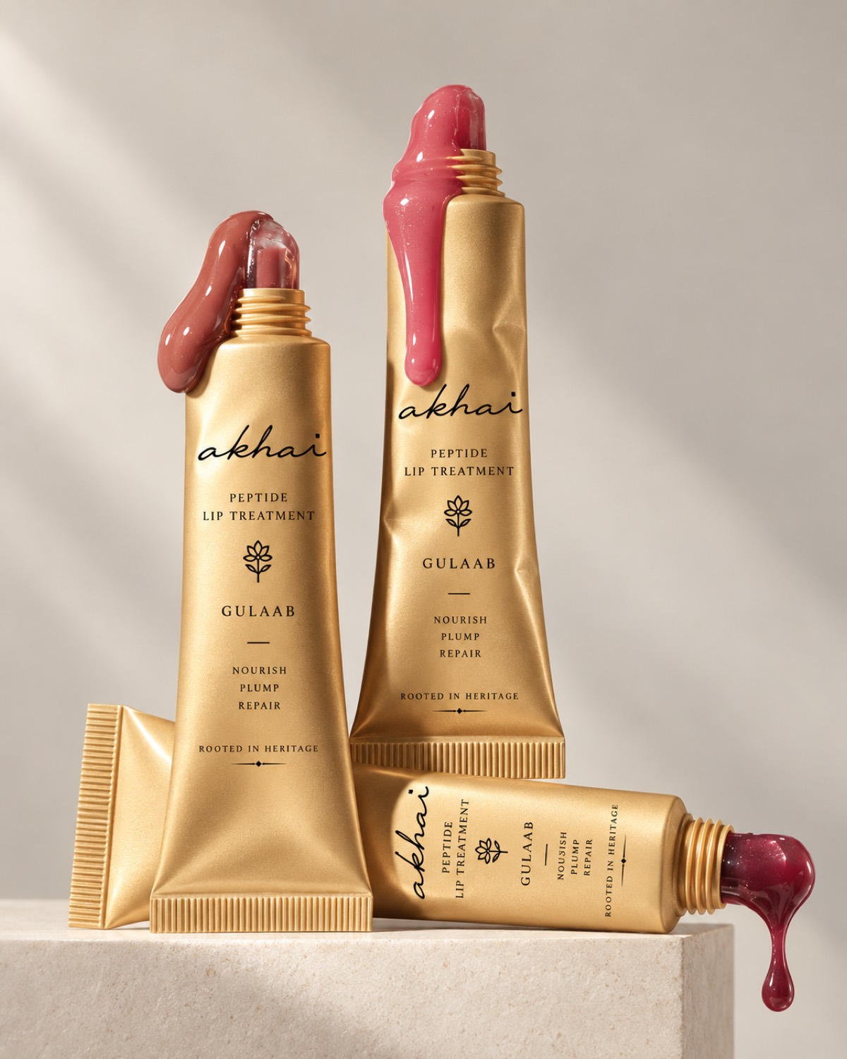
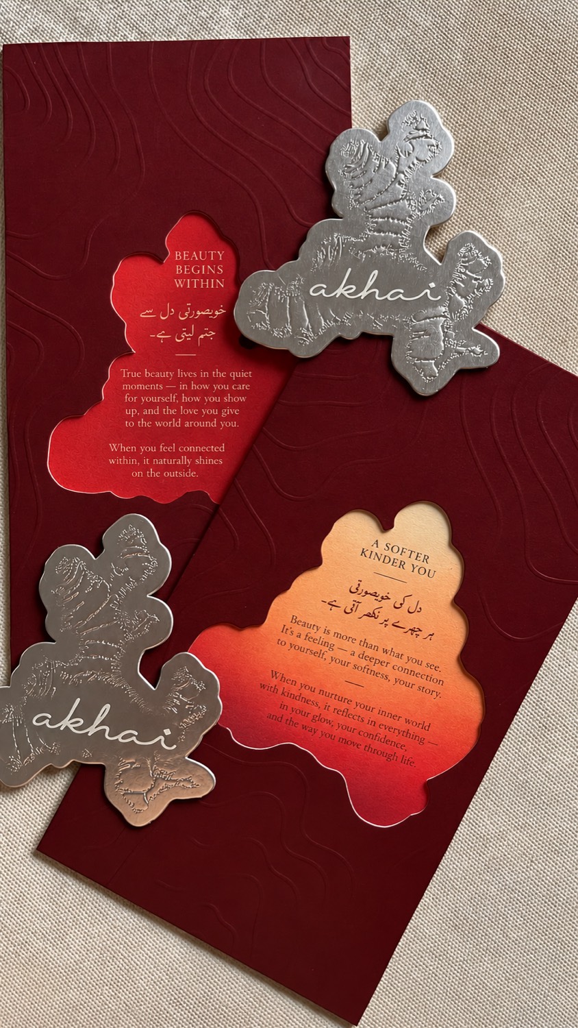
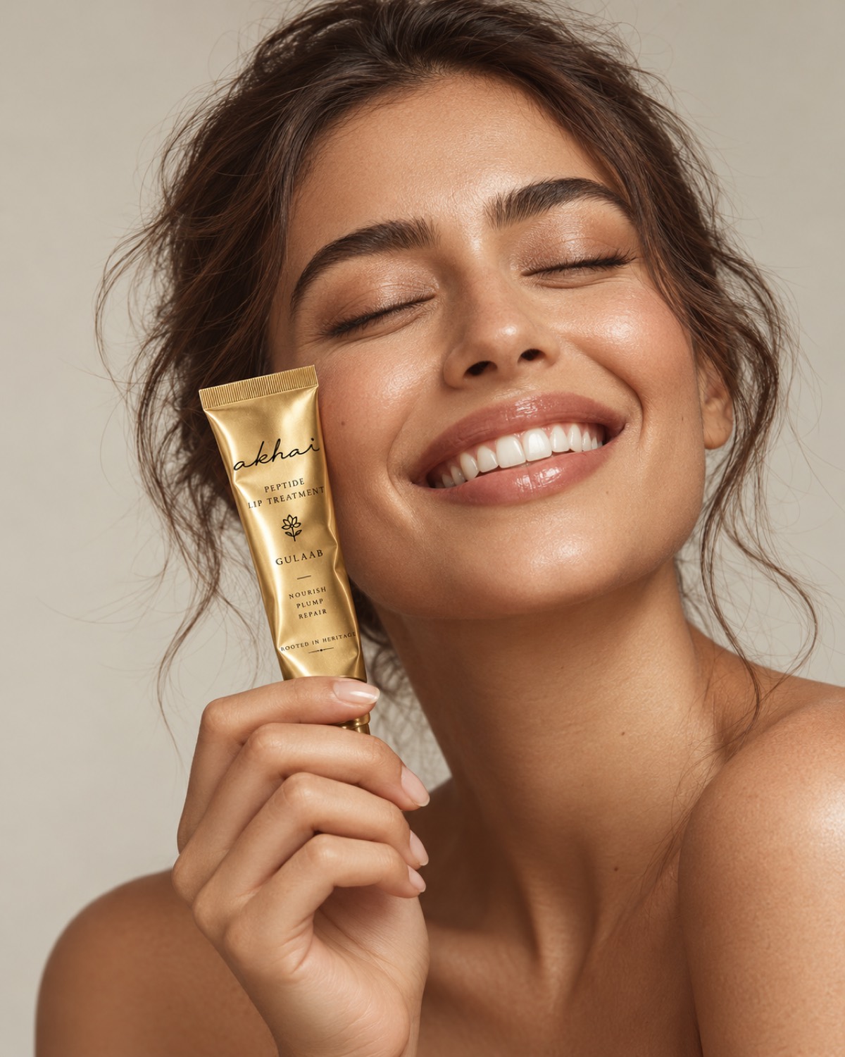
The visual language is botanical and tactile. Rich greens against soft gold, florals drawn rather than photographed, metallic detail used sparingly, and packaging that is worth the weight it has in a hand. Heritage is treated as something still in use, not as something being remembered.
The art direction was kept close and tactile. Product, skin, light, nothing else competing. Our work covered the identity, packaging, visual direction, and the broader brand world.
Nextsiren